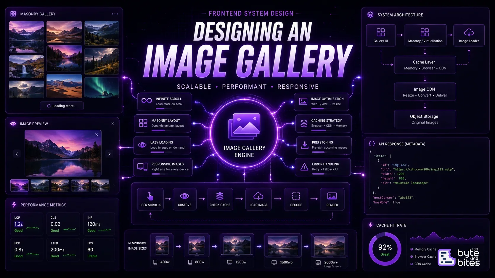
Design a frontend image gallery that supports:
- Responsive masonry layout
- Infinite scrolling
- Lazy loading
- Image optimization
- Image caching
- Image preview
- Smooth scrolling
- Large image collections
The application should remain performant even when the gallery contains thousands of images.
Requirements
Functional
- Display images in a responsive grid
- Support masonry layout
- Load more images while scrolling
- Open images in a larger preview
- Navigate between images
- Handle failed image loads
Non-functional
- Fast initial rendering
- Minimal network usage
- Smooth scrolling
- Low memory usage
- Prevent layout shifts
- Work across desktop and mobile
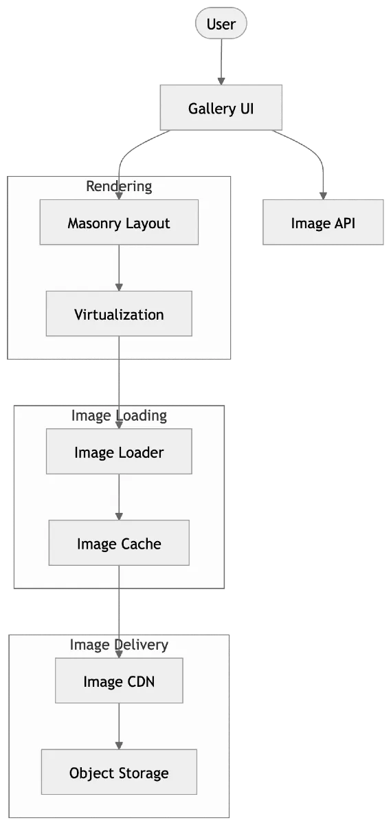
High-Level Architecture
The system can be divided into four major layers:
Gallery UI
↓
Layout & Rendering
↓
Image Loading & Caching
↓
CDN / Storage
A more complete flow:
User
↓
Gallery
↓
Masonry Layout
↓
Image Loader
↓
Cache
↓
Image CDN
↓
Object Storage
The API is responsible for returning image metadata, while the CDN handles the actual image delivery.
1. Gallery UI
The gallery is responsible for:
- Rendering image cards
- Handling scrolling
- Opening the image viewer
- Managing selection
- Showing loading states
The important part is that the UI should not render the entire dataset at once.
2. Image Data
A basic image object could look like:
interface ImageItem {
id: string;
url: string;
thumbnailUrl: string;
width: number;
height: number;
alt: string;
}
The width and height are important because they allow the layout to reserve the correct amount of space before the image loads.
This helps prevent layout shifts.
3. Masonry Layout
Unlike a traditional grid, images can have different aspect ratios.
For example:
┌───┐ ┌───┐ ┌───┐
│ │ │ │ │ │
│ │ ├───┤ │ │
│ │ │ │ │ │
├───┤ │ │ ├───┤
│ │ │ │ │ │
└───┘ └───┘ └───┘
A simple masonry algorithm can maintain the height of each column and place the next image into the shortest column.
For example:
Column 1 → 720px
Column 2 → 540px
Column 3 → 830px
Column 4 → 610px
The next image goes into Column 2.
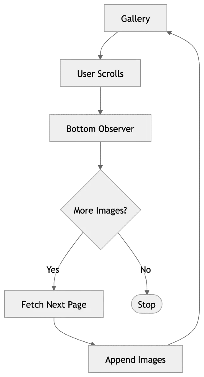
4. Infinite Scrolling
The gallery shouldn't request thousands of images upfront.
Instead, fetch images in batches.
Page 1
↓
Page 2
↓
Page 3
↓
Page 4
A cursor-based API works well:
GET /images?limit=30
Response:
{
"items": [],
"nextCursor": "abc123",
"hasMore": true
}
The next request uses the cursor:
GET /images?limit=30&cursor=abc123
An IntersectionObserver can detect when the user approaches the bottom of the gallery and trigger the next request.
5. Lazy Loading
Even after pagination, we shouldn't immediately download every image in the current page.
Only images near the viewport need to load.
Viewport
────────────────
Image 1 → Loaded
Image 2 → Loaded
Image 3 → Loaded
────────────────
Image 4 → Near viewport
Image 5 → Not loaded
Image 6 → Not loaded
Native lazy loading can handle the basic case:
<img loading="lazy" />
For more control, IntersectionObserver can be used.
6. Image Optimization
The original image might be:
4000 × 3000
5 MB
But the gallery might only display it at:
400 × 300
Sending the original image wastes bandwidth.
The image CDN should provide appropriately sized versions.
Original
↓
CDN
↓
400px / 800px / 1200px
Modern formats such as WebP and AVIF can further reduce image size.
7. Responsive Images
The browser can choose an appropriate image based on the viewport.
<img
  src="image-800.webp"
  srcset="
    image-400.webp 400w,
    image-800.webp 800w,
    image-1200.webp 1200w
  "
  sizes="(max-width: 768px) 50vw, 25vw"
  alt="ByteandBites"
/>
This prevents mobile devices from downloading unnecessarily large images.
8. Caching
Images are excellent candidates for caching.
A simplified cache hierarchy:
Memory Cache
↓
Browser Cache
↓
CDN Cache
↓
Origin Storage
If a user revisits an image, the browser or CDN can serve it without going back to the origin.
For immutable or versioned image URLs, long cache lifetimes can be used.
9. Virtualization
Lazy loading reduces network usage, but it doesn't necessarily reduce the number of DOM elements.
If the user has loaded thousands of images, the DOM can still become large.
Virtualization solves this.
Instead of:
10,000 images
↓
10,000 DOM nodes
we render approximately:
Visible images
+
Small buffer (Up and down)
As the user scrolls, elements are reused.
For a very large gallery, combining:
Pagination
+
Lazy Loading
+
Virtualization
provides much better scalability.
10. Preventing Layout Shift
Images have different dimensions.
If the browser doesn't know an image's dimensions before it loads, the layout can move when the image arrives.
Use the known dimensions from the API:
.image {
aspect-ratio: 4 / 3;
}
Or calculate the aspect ratio from the image metadata.
This allows the browser to reserve space before loading the actual image.
11. Progressive Loading
Instead of showing an empty card while a large image loads:
Blurred thumbnail
↓
Full image
The gallery can use:
- Low-resolution thumbnails
- Blur placeholders
- Dominant colors
- Skeletons
This improves perceived performance even when the network is slow.
12. Image Preview
Clicking an image can open a lightbox.
The high-resolution image should only be fetched when required.
Thumbnail
↓
User clicks
↓
Open Lightbox
↓
Load High Resolution
The lightbox can support:
- Previous / next
- Zoom
- Fullscreen
- Keyboard navigation
- Escape to close
13. State Management
Separate gallery data from UI state.
Gallery data:
interface GalleryState {
images: ImageItem[];
nextCursor: string | null;
hasMore: boolean;
loading: boolean;
}
UI state:
interface GalleryUIState {
selectedImageId: string | null;
lightboxOpen: boolean;
zoom: number;
}
This prevents UI interactions from unnecessarily affecting the entire gallery.
14. Performance Strategy
There are several different performance problems, and each requires a different solution.
| Problem | Solution |
|---|---|
| Too much data | Pagination |
| Too many DOM nodes | Virtualization |
| Too many network requests | Lazy loading |
| Large images | CDN resizing |
| Large image formats | WebP / AVIF |
| Repeated downloads | Browser/CDN cache |
| Slow perceived loading | Progressive loading |
| Layout movement | Reserve aspect ratio |
| Slow API | Caching / pagination |
The important point is that no single optimization solves the entire problem.
15. Error Handling
Images can fail because of:
- Network errors
- Invalid URLs
- CDN failures
- Deleted images
Show a fallback instead of a broken image:
┌──────┐
│ │
│ Image failed │
│ │
│ Retry │
└──────┘
Retries should be limited to avoid continuously requesting a failed resource.
16. Accessibility
The gallery should support:
- Meaningful alt text
- Keyboard navigation
- Focus management
- Accessible lightbox
- Escape to close
- Screen-reader labels
- Reduced-motion preferences
Performance should not come at the cost of accessibility.
Data Flow
The complete flow looks like:
User opens gallery
↓
Fetch image metadata
↓
Render initial layout
↓
Determine visible images
↓
Check cache
↓
Request image from CDN
↓
Decode image
↓
Render
↓
User scrolls
↓
Load upcoming images
↓
Fetch next metadata page
↓
Continue
Final Architecture
Trade-offs
Lazy Loading vs Prefetching
Lazy loading saves bandwidth, while prefetching improves perceived speed.
A good implementation uses a small prefetch window rather than loading everything.
Virtualization vs Simplicity
Virtualization improves performance for huge galleries but makes masonry layouts more complex.
For a small gallery, it may not be worth the complexity.
CDN Transformation vs Pre-generated Images
Dynamic CDN resizing is flexible but adds infrastructure dependency.
Pre-generated sizes are simpler but increase storage requirements.
What Interviewers May Ask Next
- How would you support millions of images?
- How would you implement masonry virtualization?
- How would you optimize for mobile networks?
- How would you prevent layout shifts?
- How would you handle CDN failures?
- How would you implement offline image caching?
- How would you prioritize above-the-fold images?
- When would you choose virtualization over pagination?
- How would you measure gallery performance?